Congratulations, somebody signed up for your offer! Now you need to send them a quick email to thank and welcome them. How can you go about creating this message?
There are many different formats a welcome email can take. Here are four approaches:
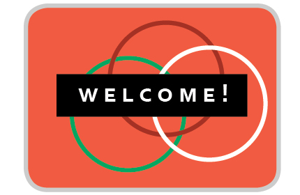
Splash welcome emails
- What it looks like: A splash email format looks like one large image or color that dominates pretty much the entire background of the message. There is usually a short message overlaid on top.
- What it does: One large image or a dominating color field is used to set the mood. That is, it represents a speci fic emotional promise; your primary value to your audience is how you make them feel.
- When it’s best: Splash emails are appropriate for 1) established brands and 2) value propositions that are primarily fantasy-based. If your audience is already familiar with your brand and you don’t need to offer them much additional information, or if you’re selling something that primarily appeals to some sort of ideal (such as a fashion statement, a delicious meal, a home interior, a romantic trip, etc.), this type of email may serve you well.
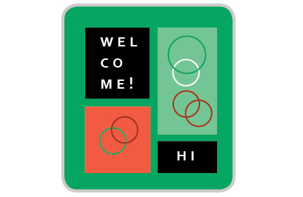
Showcase welcome emails
- What it looks like: A showcase email format looks like a grid of multiple images and/or text.
- What it does: Whenever you are creating a showcase, you are demonstrating the diversity in your offer. This means that your value to your audience is the variety of experiences they can have with you.
- When it’s best: Showcase emails are best for o ffers in which giving the consumer a lot of choice is a key part of the experience. Businesses such as fashion retailers, education providers, and travel agencies could benefit from this format.
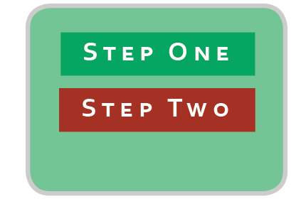
To Do welcome emails
- What it looks like: A to do email is essentially a list of next steps the audience should take. These steps may be suggestions or required actions—make sure it is obvious which is which.
- What it does: This email format is used for orientation. The audience should feel like they know exactly what to do next, when to do it, and how to do it. Your goal is to guide them to the next step in their experience.
- When it’s best: These kinds of emails are best for o ffers in which there is a somewhat steep learning curve. If it’s likely that your audience may not be able to intuit the next step on their own, this email format will allow them to keep going without getting lost. Any sort of business that requires setup or learning, like a consultant that requires background documents or a so ftware that needs customizing, should consider using this format.
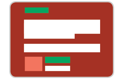
Letter welcome emails
- What it looks like: A letter email format looks like, well, a letter. It is closest to what a reader of a magazine might find on the “Letter from the Editor” page.
- What it does: This email format creates a sense of formality and politeness. It also creates the sense that the audience has one-on-one contact with the company behind the message.
- When it’s best: Letters work best for companies in which one key personality is the primary value to the audience. For example, coaches, thought leaders, artists/musicians, and comedians can use this format to increase the sense of connection between themselves and their audience.
Which of the formats seems most aligned with the value of your offer? Is your primary benefit to the audience a fantasy, diversity, a multi-step experience, or a connection with you? Or maybe some combination? Note: You can mix and match up to two formats. However, make it very clear which is the dominant format—it never helps to confuse the audience!
Here are some examples of welcome emails I’ve created this week:
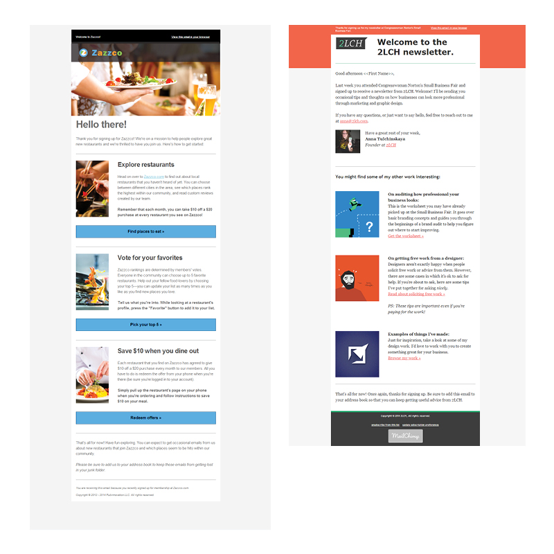
The email on the left is for a new food discovery startup called Zazzco. There is a bit of a learning curve with this tool, so I chose to go with the To Do email format. Note that the tasks don’t have to read like a typical to-do list. Instead, you can phrase them as value propositions.
On the right is a welcome email I just sent out for my new newsletter (please sign up!). This is a hybrid format; since my business does rely on my personality, I started off the welcome with a letter, and then followed this letter with a showcase to demonstrate the variety of information I can offer to the audience.
Ready to give it a shot yourself? The full worksheet that you can download below describes these four types and goes on to provide several other things to keep in mind—such as personalization, deciding whether to send a series of welcome emails, and setting expectations. Download it below!
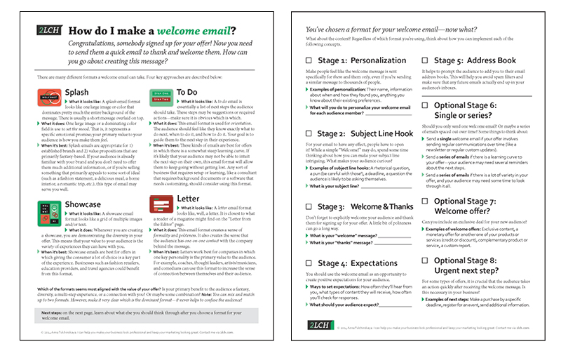
Two ways to get the worksheet:
- Get it for FREE by downloading it here. No strings attached, I hope it helps! If you do the worksheet, I’d love to hear your comments.
- Choose to pay a small fee for the time it took me to make this worksheet. Please use the form below to do so.
