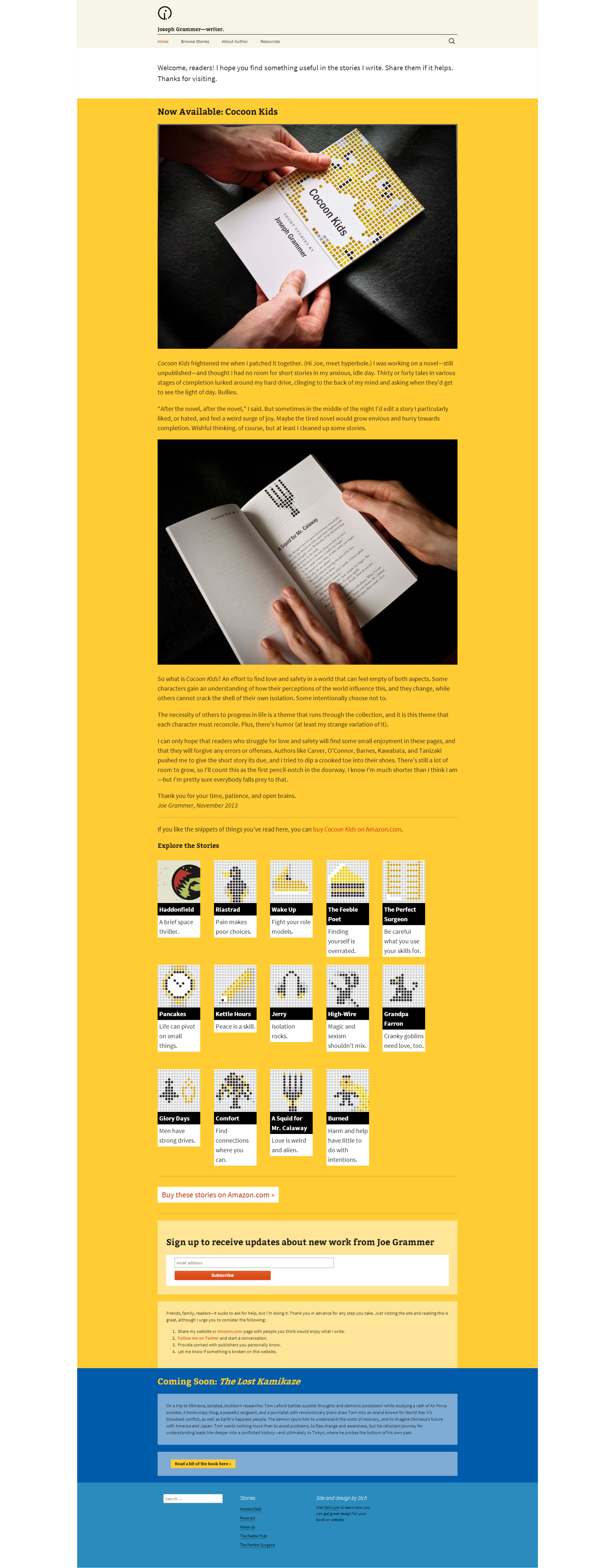
I thought it might be helpful to share my process for creating a website for Joseph Grammer, an author looking to create a platform from which he can grow readership for his fiction and promote his work. There were several challenges present in this project—a limited budget, a lack of precedent, and lack of close familiarity with the target audience. Nonetheless, I worked with Joseph to carefully think through his needs for his website and created an online presence suited to his needs within the constraints. Here is how we did it.
Step One: Audience
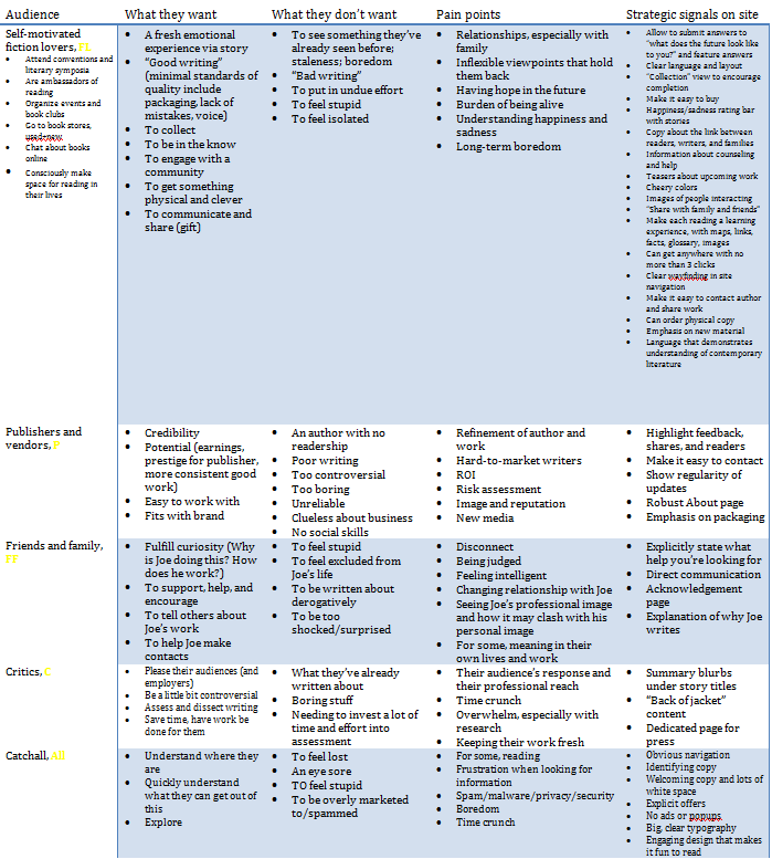
We sat down for a general discussion of how the website will need to be used. The first and most important thing to understand was the target audience. We identified all the key audience groups for the site, which included general readers, potential publishers, friends and family, and even random people who accidentally land on the site. For each audience group, we identified what they want and do not want in their experience, their particular pain points, and ideas for specific things we can do on the site to address these traits.
Step Two: Brand
After this audience brainstorming session, we discussed what Joseph wanted to communicate through his brand. These key words were then used to brainstorm graphic elements, colors, and other general “look and feel” considerations. In addition to defining key words, we defined the “brand antithesis” to create greater rigor in the brand definition.

Step Three: Goals
Finally, we discussed how Joseph will measure the success of his website. This helped focus on the most critical elements of the website from a business perspective.

Step Four: Information Architecture
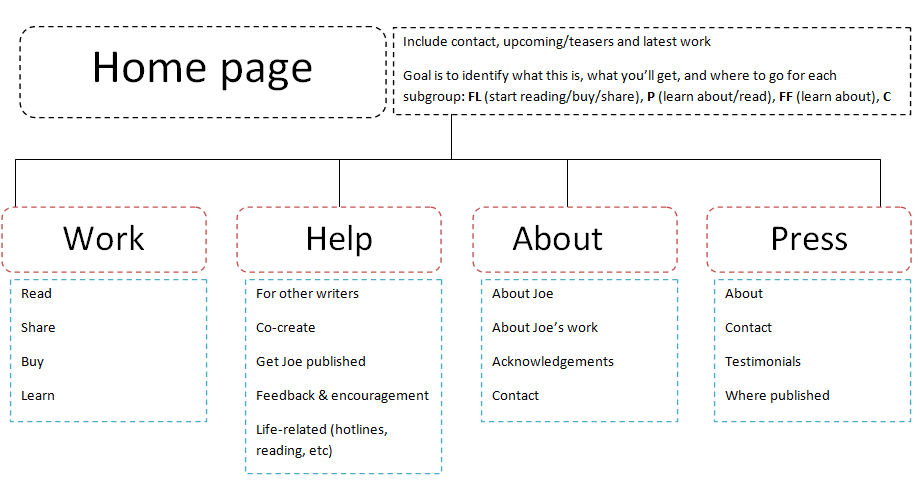
After our conversation, I started planning the website. First came a very basic information architecture diagram to think through how content will be organized.
Step Five: “Best case” wireframes
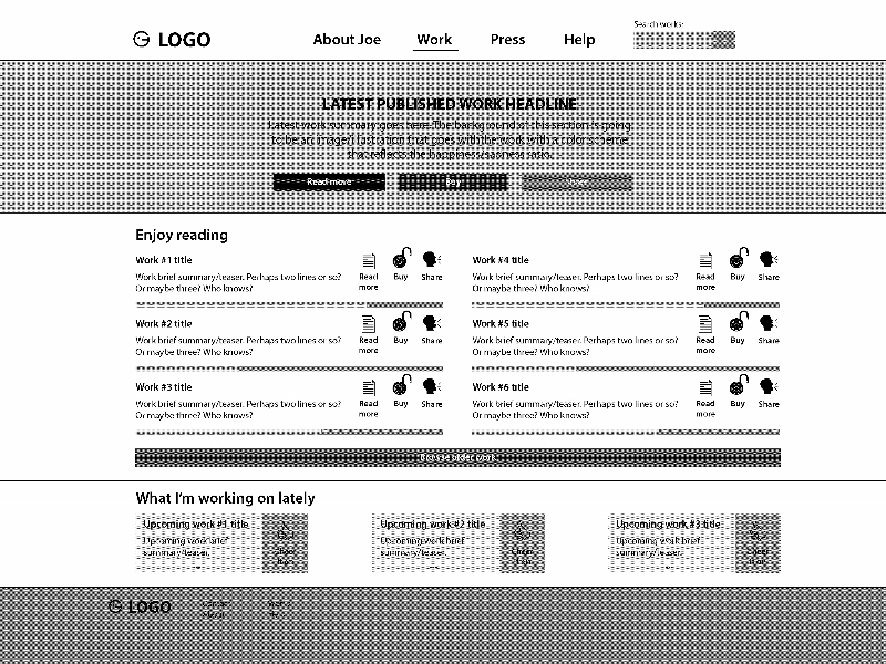
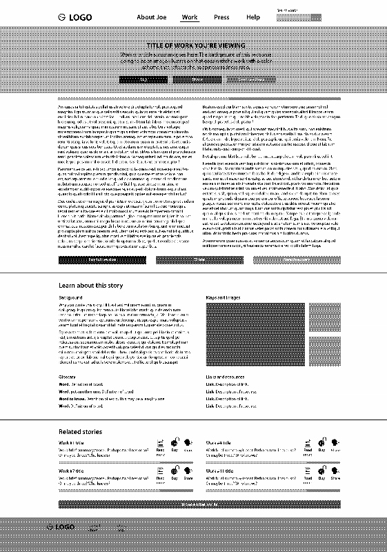
Wireframes are a design brainstorming tool that does not address visual design and instead helps plan a basic layout and page elements. I started by creating “best case” wireframes—basically, what could be built if budget and time were not constraints, based on what Joseph wanted to get out of his website. This made sure that I was not dismissing ideas too early because of the constraints and set the stage for creating the best project possible. Following are a few examples.
Step Six: Building the website
After Joseph approved the “best case” wireframes and we discussed the limitations we would have to consider, I began building the website. Many features of the “best case” version did not get built due to budget and time constraints. However, all the critical “must have” components of the website were built.
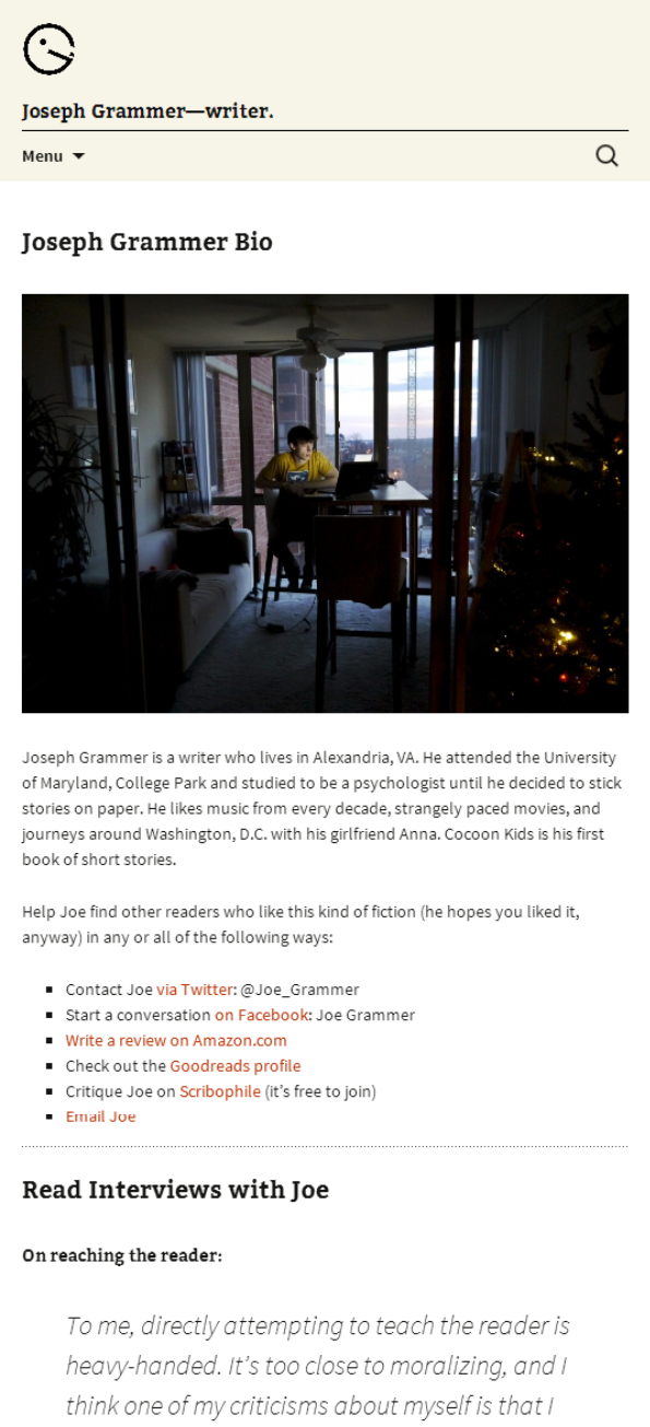
The website was also designed to be responsive, dynamically rearranging the layout based on screen size to ensure that it can be viewed well on mobile. An example of how part of a page would look on a phone is below.
Joseph is very happy with this site. It’s a great starting platform for promoting his work and maintaining a professional presence on the web. Take a look at it yourself!
