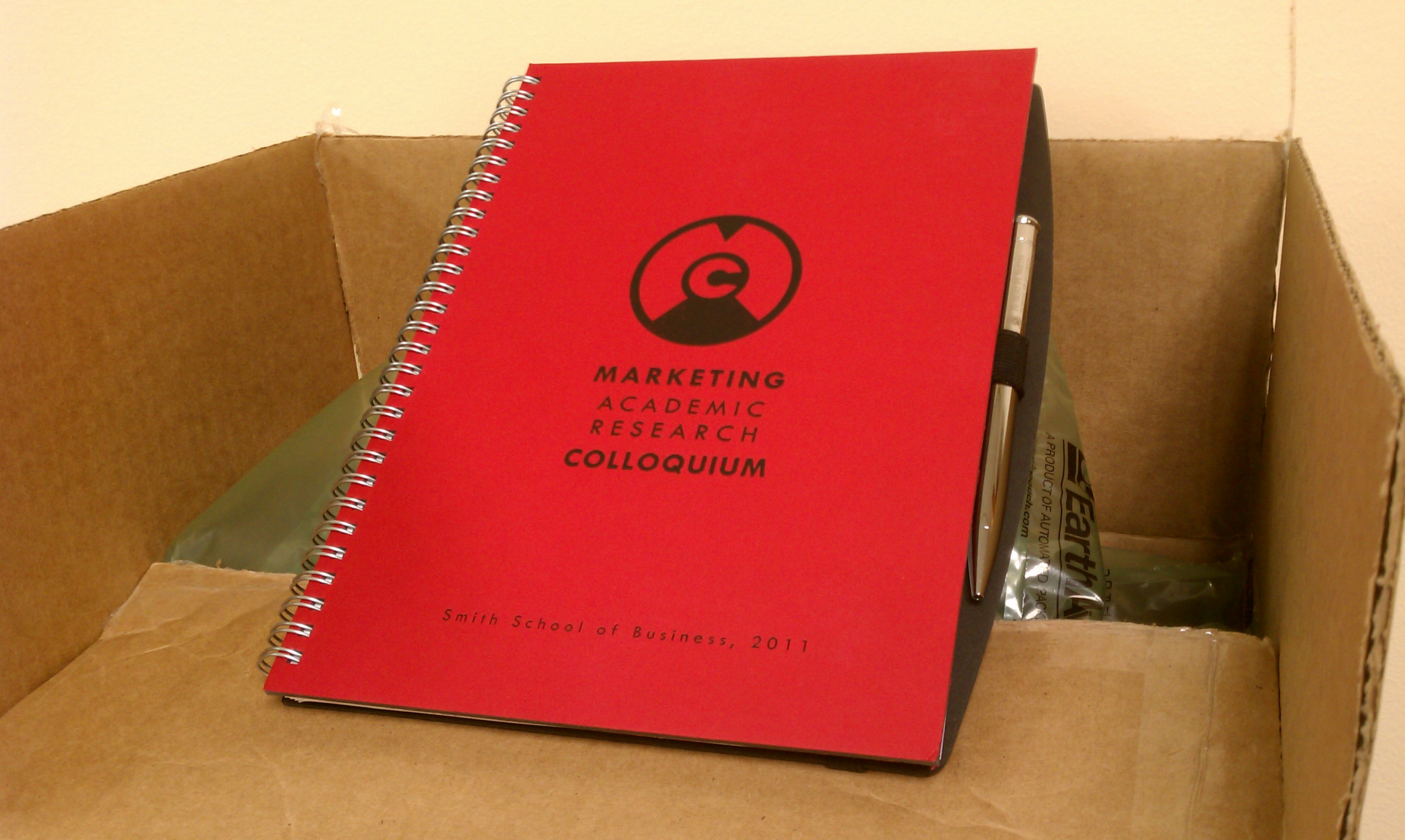
These aren’t pretty pictures, but some of the collateral that I’ve designed for an upcoming conference arrived today. Thought I’d share. It’s nice to help out my alma mater.
With this one, I had fun playing with a letterform-driven logo solution that represents the unlocking of ideas. Hence the keyhole imagery and a quirky (and meaningless, to be honest) visual reference to Moscow metro tokens.

