First of all, this is a great piece of fiction.
Mario Vargas LLosa takes you on a whirlwind exploration of a Peruvian clash of old and new, superstitious and productive, magical and violent. I read this book in one sitting.
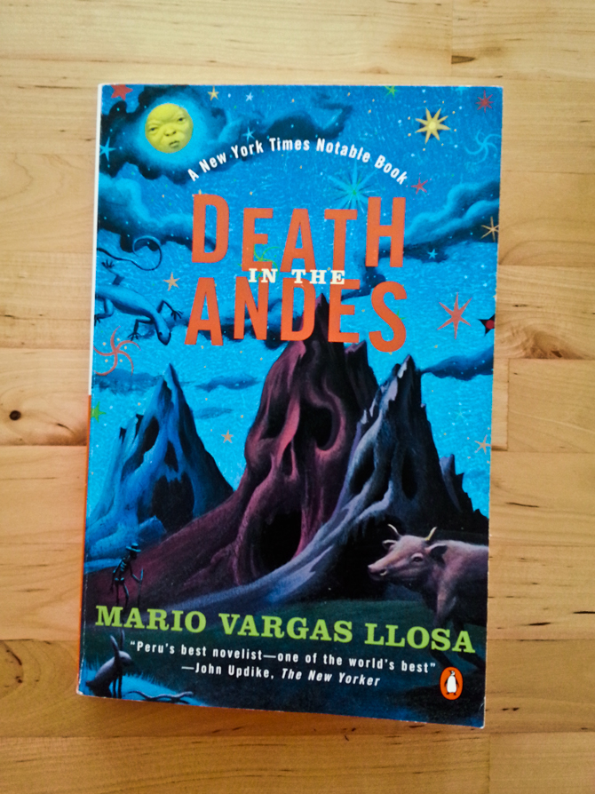
It’s just a cherry on top that I also really like the cover. It’s strange, because this is not the kind of design I would normally like. Yet of all the editions of this book I’ve seen, this is probably my favorite. The illustration perfectly captures the sense of disturbing whimsy that you feel after you read the story (also, I think the cover of the latest edition is too forward on the disturbing part). Plus, the typography choices in the title really work with the image here. I’m not sure what it is, but something works.

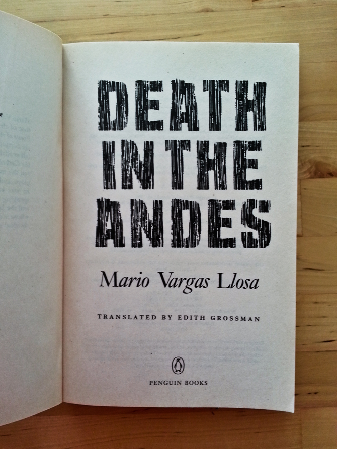
The one thing that I’m not a fan of is that when you open the book, it looks as if the cover didn’t exist. There’s a title page with a completely different typographic treatment. And why oh why would anyone have every character in the author’s name in italics except the first letters??! Aye! Look at how foreign those two L’s in “Llosa” look next to each other!
