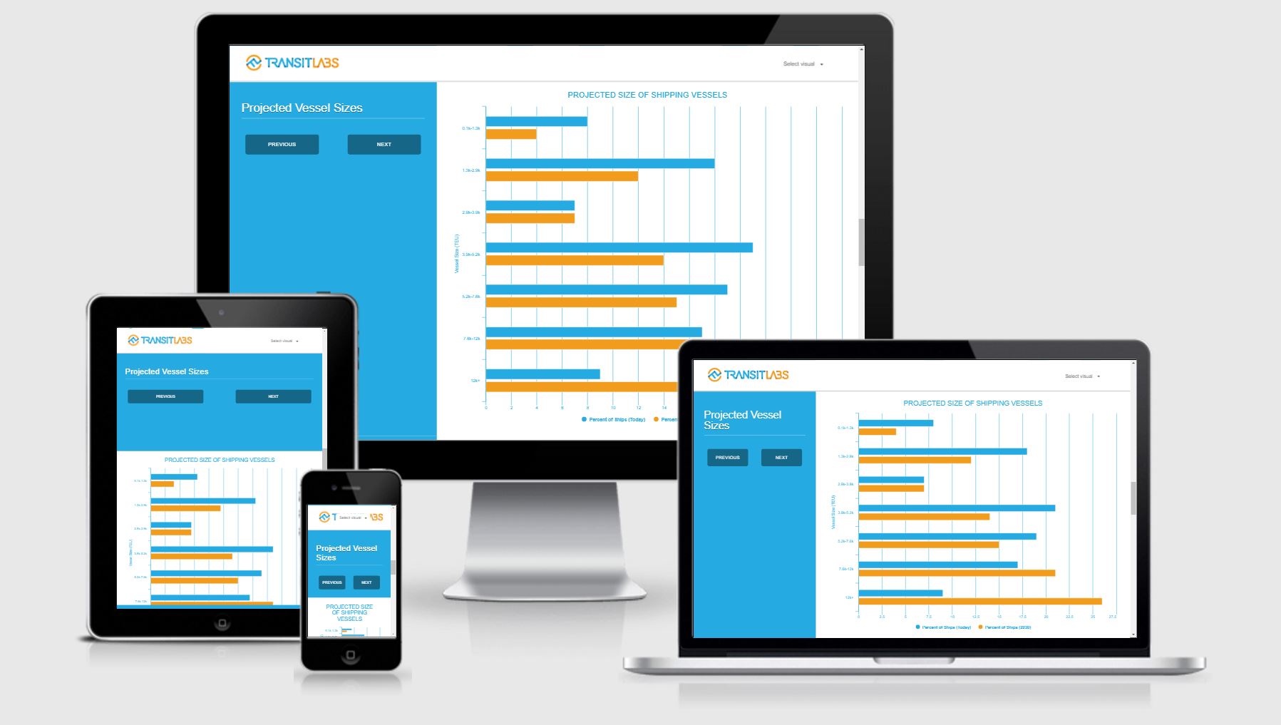
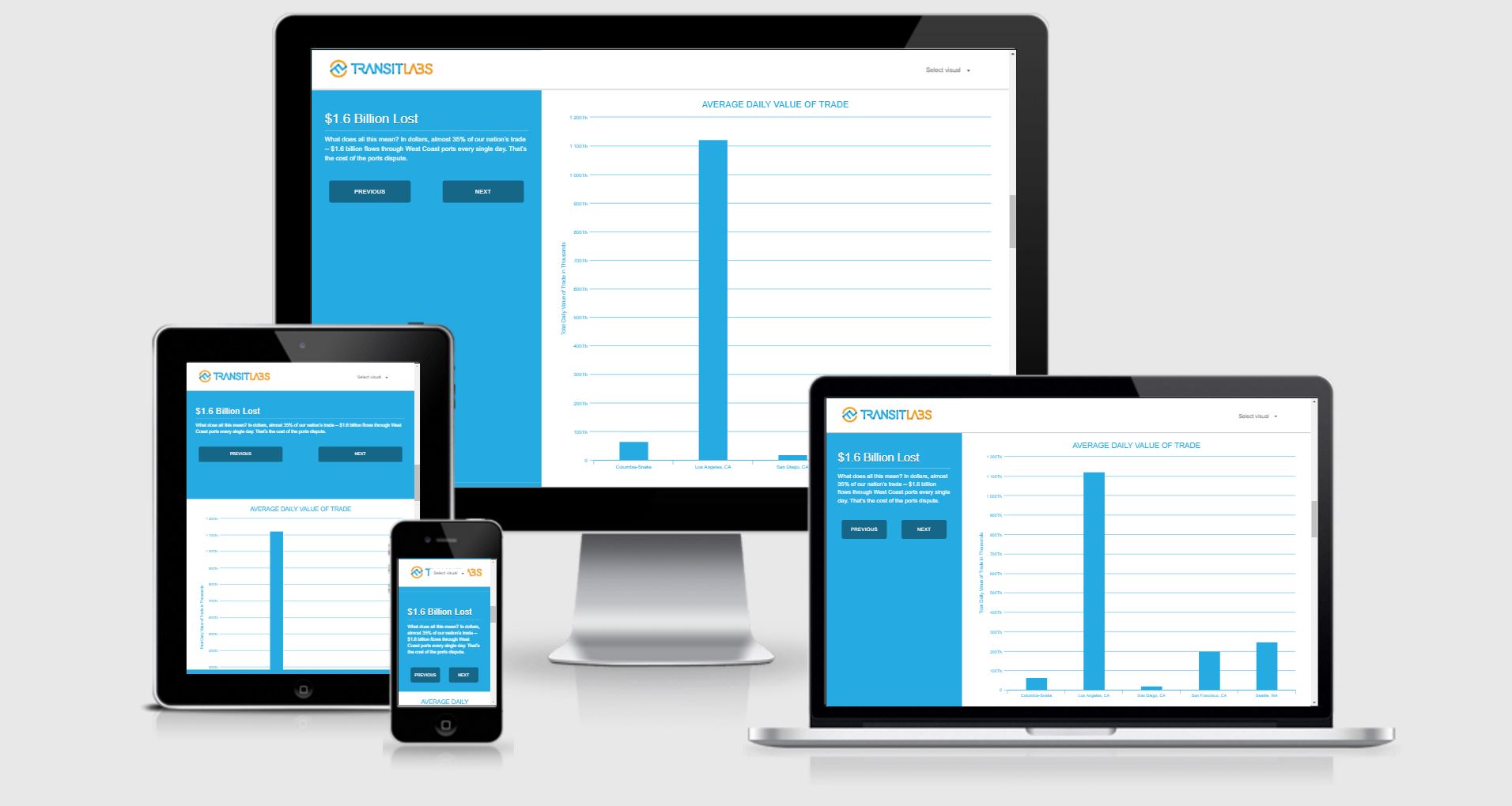
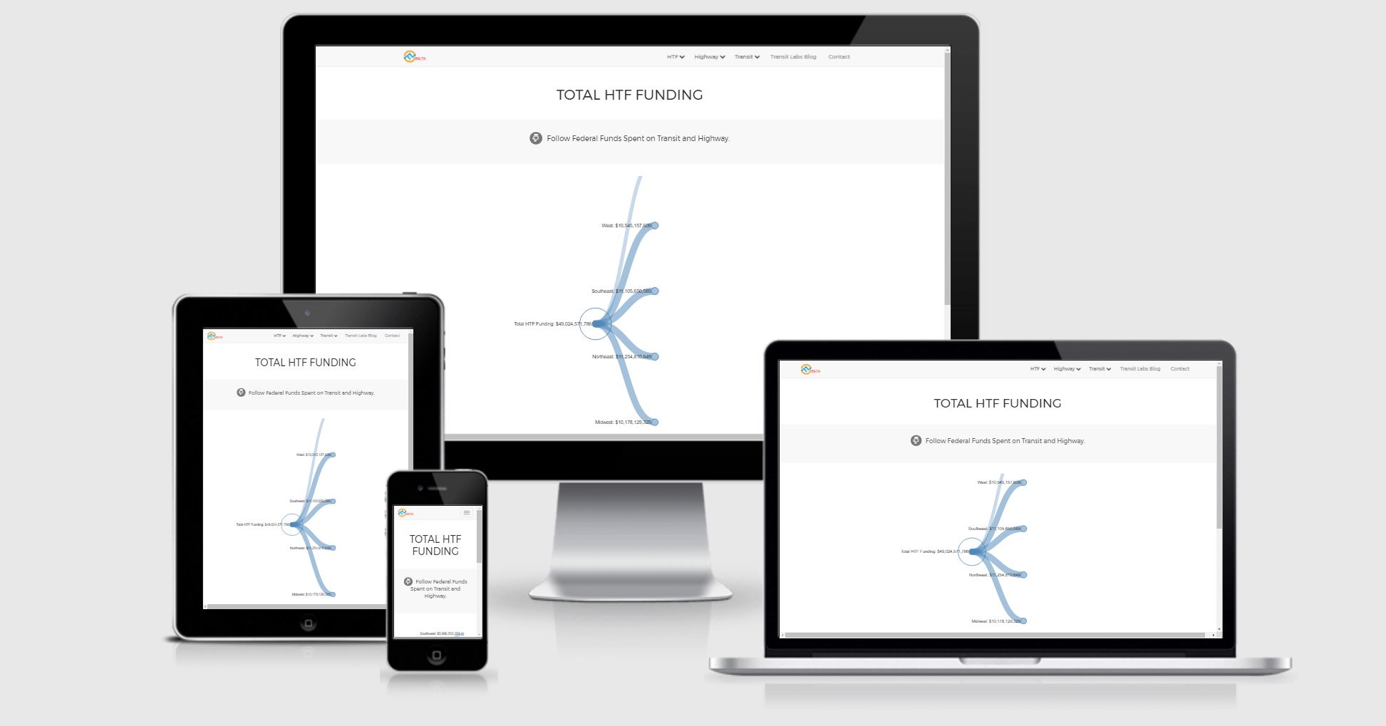
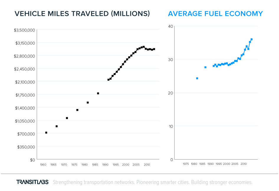
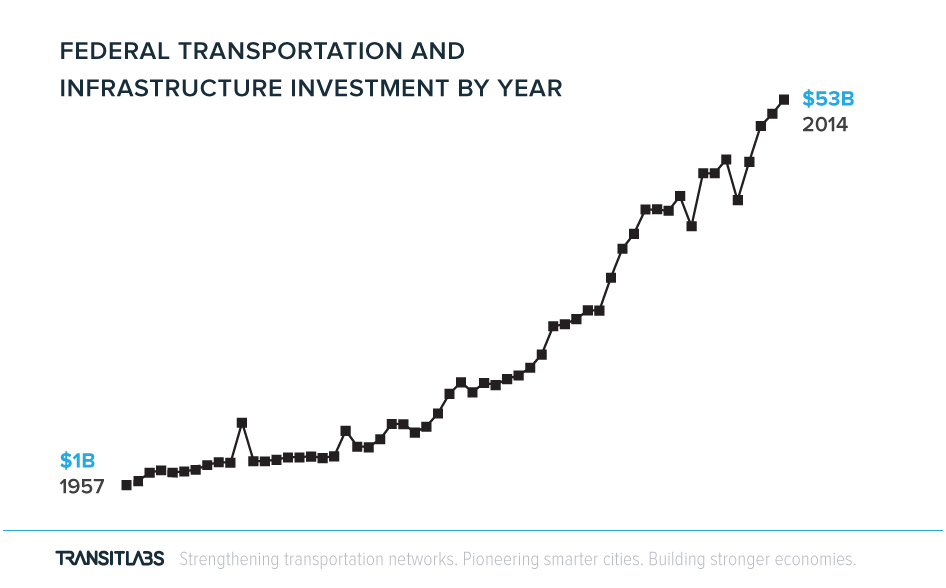
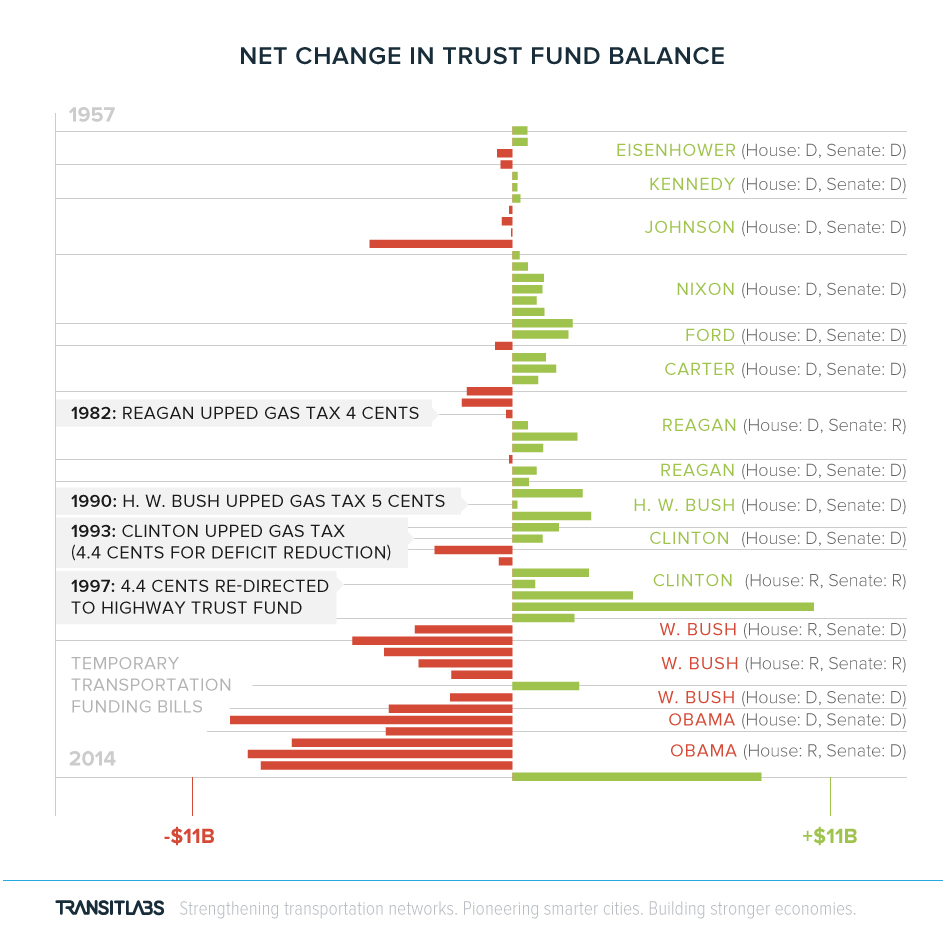
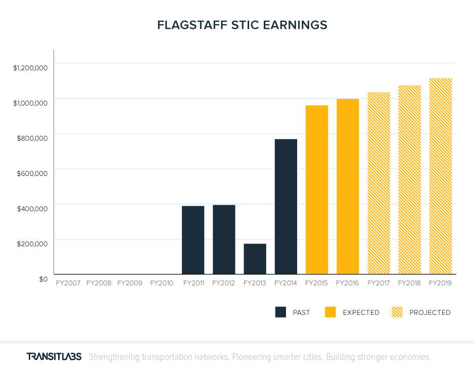
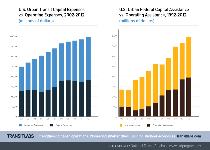
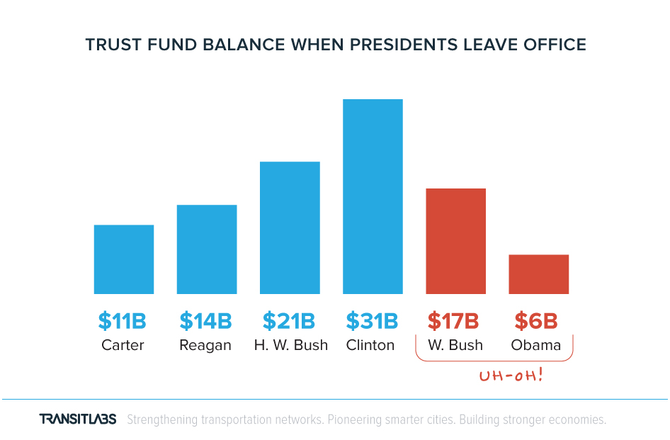
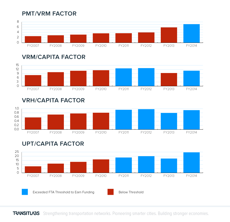
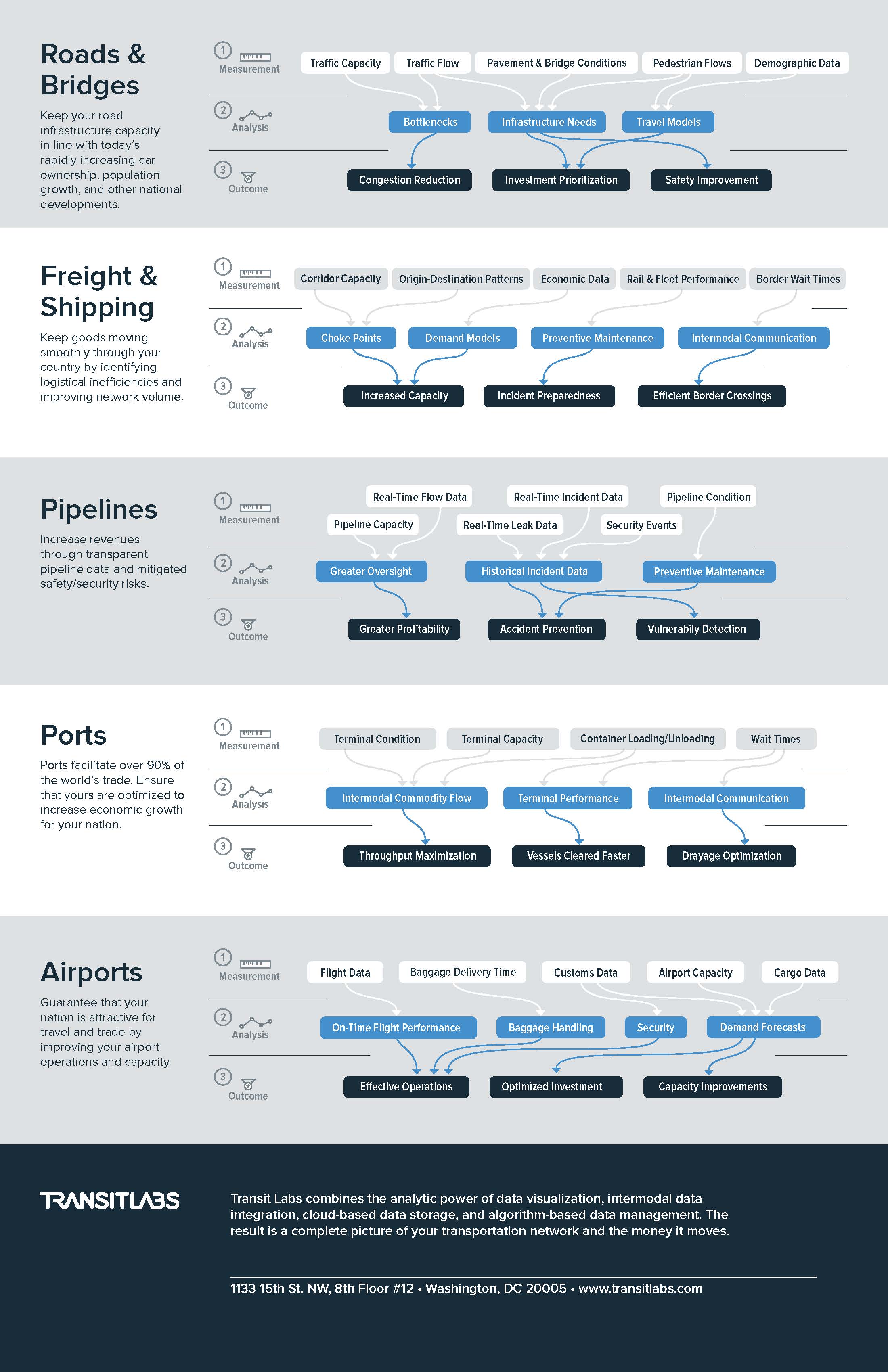
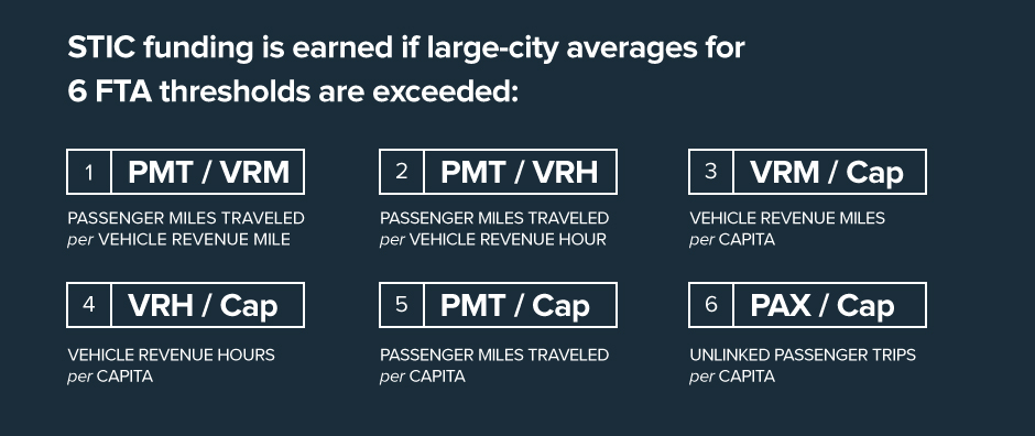
Transit Labs is a startup working to enable better decision-making in the transportation industry through better access to data and data analysis tools. We worked together to expand on the brand identity through various visuals that help establish the startup as a bold “breath of fresh air” in the industry, and to visualize available data in a variety of formats. The aim was to use a variety of content to campaign for a specific point of view promoting change in the transportation space.
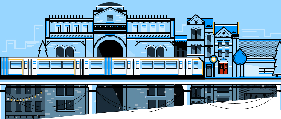
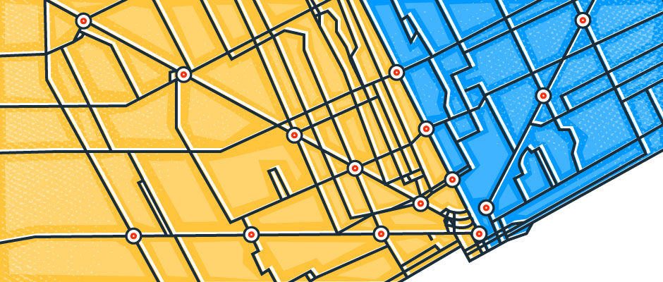
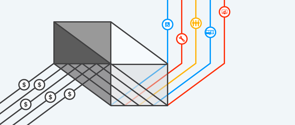
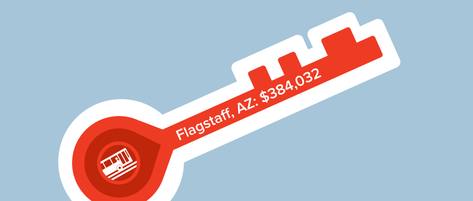
We began by collaborating across the organization to create a series of images to accompany blog posts, the goal of which was to communicate a bold point of view. The images are therefore intentionally unusual for the transportation space, either due to the level illustrative detail represented, or the boldness of the color palette and iconography.



Branding Lesson
Be sure to stick to a singular color palette across all blog post images in order to create a cohesive, branded appearance for your content. This way, your infographics will look like they all belong to the same narrative no matter what information they represent. Aim to use bolder colors and more negative space if you want the images to communicate a sense of urgency and energy.
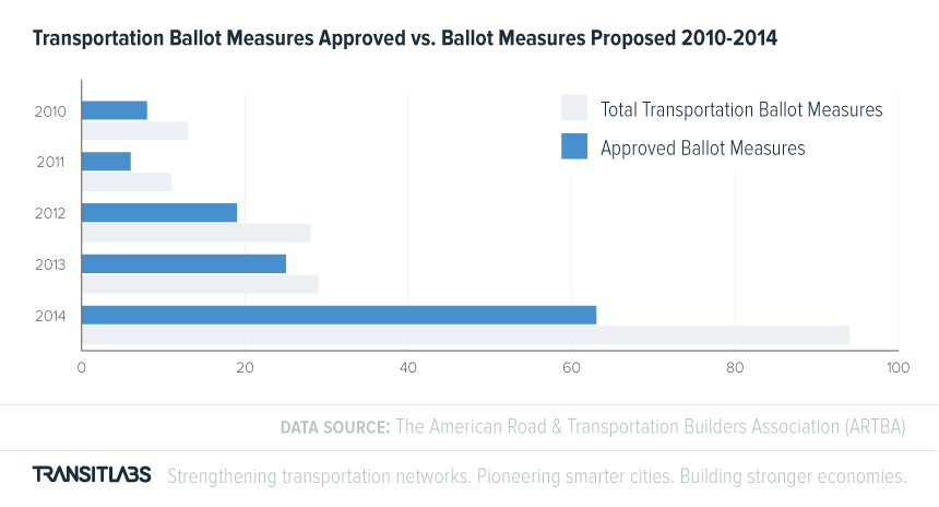
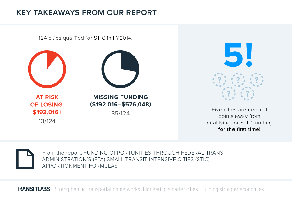
We also worked together to represent various data in formats that included print reports, standalone online entities, direct mail pieces, and blog posts. The graph types chosen were traditional in order to give audiences a familiar format, and therefore facilitate understanding of the data. Design-wise, the focus was on creating a sense of visual consistency across all graphs and visually reducing overwhelm through a disciplined approach to layout, colors, and typography.
